In our last design blog post, we explored the ways in which Henkaku principles could be applied to DAL’s design work in practice, along with some examples from our portfolio. At the end of the post, we briefly touched on the concept of what is called “headless branding,” which our former design partner, Pentagram, mentioned in “Towards Henkaku” report as an area for future exploration.
In this blog post, I will reflect upon my experience of applying headless branding principles to one of my recent projects: the Neurodiversity School in Tokyo (NSIT). I’ll walk you through what worked, what didn’t and what I learned from this experiment.
Headless Branding
Branding in the traditional sense requires consistency, as in this quote from Koto Studio:
Brands are results, established in the mind, built over time. Repeated actions create strong patterns and people’s minds like patterns. The clearer the pattern, the more identifiable the brand.
By contrast, headless branding seeks to create a more inclusive and participatory approach. This model encourages and embraces the contributions and engagement of a diverse and extensive community of users, allowing them to have a sense of ownership and influence over the brand’s identity and direction.
As Pentagram wrote in the “Towards Henkaku” report:
In this sense, the notion of even “branding” Henkaku in an overtly singular way becomes misguided. The design field’s current, top-down approach to branding hinges on the standards manual, a comprehensive guidelines document that outlines the proper (and improper) ways a brand’s visual identity should be implemented out in the world.
Instead, for Henkaku what can be explored is what has been referred to as a “headless brand,” meaning one without any single, centralized source of truth like a guidelines document, but rather one with a truly shared graphic lexicon that can be deployed, adapted, and remixed at will. While some level of standardization may be necessary, a “headless brand” is ultimately both governed and perpetuated by the community of users.
Pentagram further illustrates the concept with the following examples:
1. Algorithmically-driven
Generative logos blur the lines between graphic design and creative technology. Examples include the former MIT Media Lab logo with 40,000 variations, the COP15 logo visualizing a swirling planet based on data-driven parameters, and the Breaker logo using “flocking” line segments to evoke blockchain technology.
2. Community-informed
Some generative logos use data in meaningful ways to communicate story and emotion, providing a window into a community of users. Examples include the Playwrights Horizon logo, the Clubhouse logo using user portraits, and the Walt Disney Concert Hall projection by Refik Anadol.
3. Frameworks for customization
Design frameworks with standardized elements allow for visual consistency and variability. The National Open Youth Orchestra and The Q Project exemplify this approach, while the “Abstract Type Generator” by And Repeat showcases the potential of custom software in generating modular lexicons.
4. Data portrait
“Data portraits” are composite images of personal data that can represent the intersectional nature of human identity. Examples include the “What Counts” installation at the Museum of the City of New York and personalized data visualizations at the TED conference in 2017.
At a methodological level, headless branding boils down to a framework for visualizing data that results in multiple variations of the data input, which we perceive as a single, personalized, yet consistent identity. This approach, if executed well, can potentially allow for greater flexibility and adaptability in brand representation while maintaining the core essence of the brand.
Case Study: NSIT
Neurodiversity School in Tokyo (NSIT), which opened in September 2024, is a pioneering school that nurtures each child’s unique potential, respects diversity, and aims to transform education and society through innovative practices. Led by DAL’s Chief Architect, Joi, the project aims to improve education and change societal perspectives through new learning methods. NSIT’s brand identity development, guided by headless branding principles, involved collaborative efforts from the team. As a brand designer, I played a role in conceptualizing and crafting NSIT’s visual identity, ensuring it reflects the school’s mission and ethos.
What is Neurodiversity?
Neurodiversity is the concept of recognizing and respecting the diversity of various characteristics at the individual level, stemming from the brain and nervous system. It aims to harness these differences within society and promote mutual respect. Neurodiversity is crucial for the well-being of individuals, communities, societies, and the world, serving as a philosophy that will advance society and the world.
Everyone has a certain degree of unique ability. We believe that developing the intelligence of each individual is of significant value to a society that seeks to expand creativity.
Neurodiversity as a concept aligns well with the principles of headless branding. Both value different ways of thinking and self-expression. Headless branding doesn’t use strict rules, letting people adapt the brand to show their own views. This matches how neurodiversity celebrates different minds. In practice, this means welcoming diverse inputs to shape the brand, allowing flexible use of brand elements, and encouraging creative, personal interpretations. The result is a brand that truly reflects the community it represents. I used these ideas throughout the design process for NSIT’s identity, aiming to create a visual language that embraces and expresses the diversity of neurodivergent experiences.
We began the exploration for NSIT’s brand identity by thinking about how children interact with the world, understand it, and learn from it. This is a living experience – moldable and continuous. We asked ourselves: What natural rhythm reflects the ebb and flow of a child’s development? Is there a universal human experience that captures this constant exchange with the world? This line of questioning led us to the concept of “breathing”.
So breathing became the basic motif of NSIT’s brand identity. It’s an act essential for our lives, dynamic and cyclical. Breathing is a process of interaction with the world, bringing what is outside in and expressing what is inside out. It’s constantly moving, naturally expanding and contracting, changing shapes. We found this analogous to how children engage with their environment, absorb information, and grow.
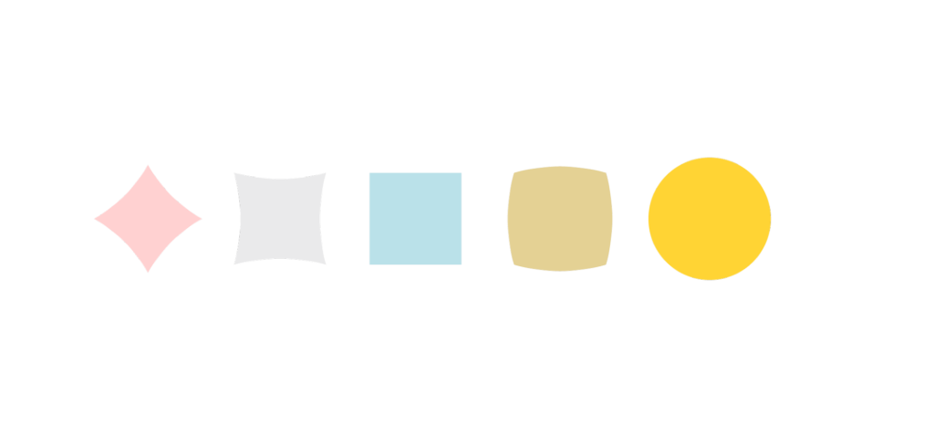
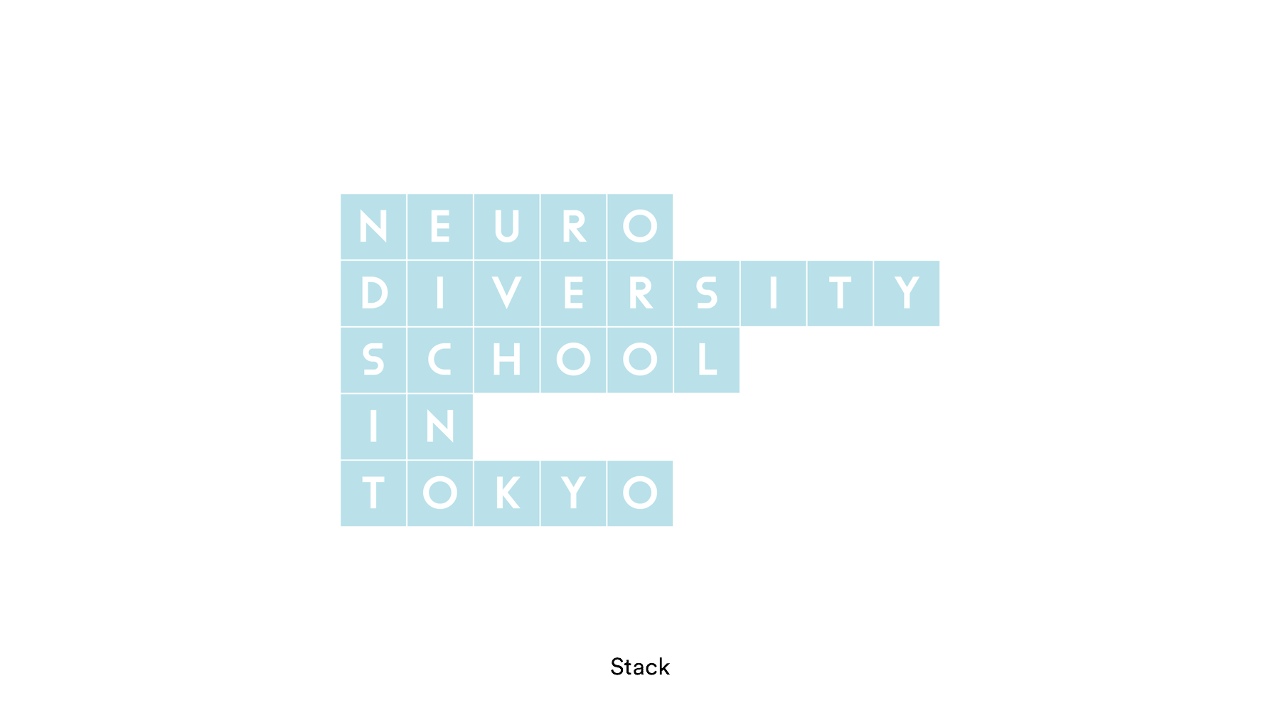
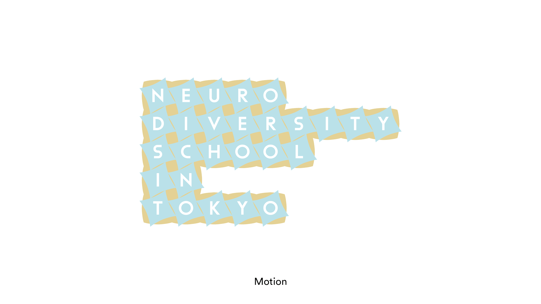
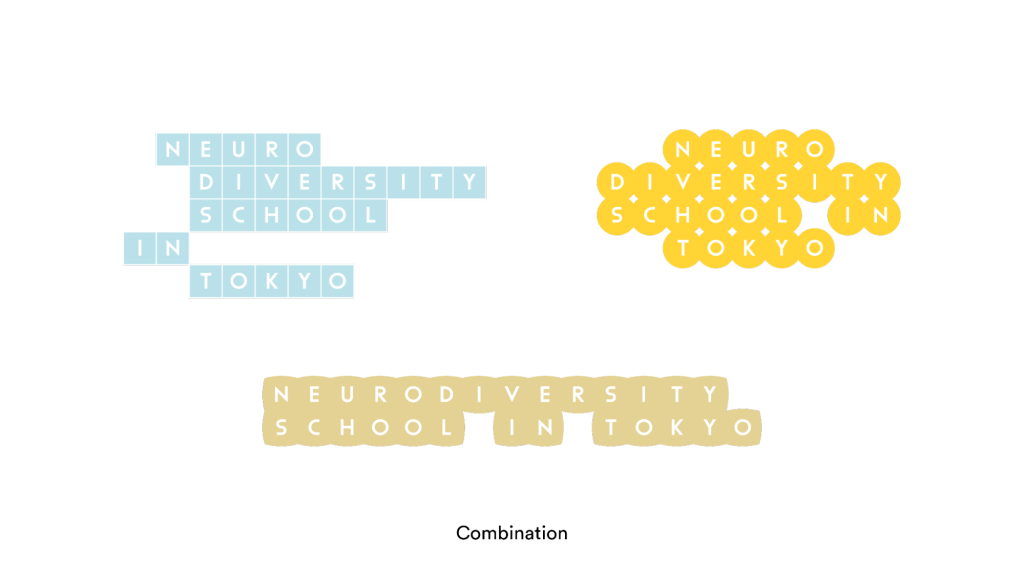
Based on this motif, I created five key objects, which I stacked, moved, and combined to represent the dynamism and diversity of children. The five different shapes and colors of these objects symbolize their boundless potential. The initial plan was really simple. I asked myself: “Can I create five key elements from breathing and put them together in different combinations to represent something?”
This approach embodies the spirit of headless branding, which, in theory, allows you to embrace and capture a wider range of individual characteristics. The flexibility of combining these elements mirrors the adaptability and individuality celebrated in neurodiversity.
However, when I went on to develop the design further, I encountered a few challenges. The process of translating this conceptual approach into a cohesive visual identity proved to be a much more complex task than imagined.
The Challenges
Challenge 1: Difficulty in coming up with one unified look
Now that we had a whole variety of different expressions instead of one single logo, I needed to ensure that all the different looks would be recognizable as NSIT. And even with a distinct look, consistently communicating over a long period would be necessary to build trust with people, and achieving that during the initial creation phase is a tall order.
Challenge 2: Putting the design into practice
Many organizations face a lack of time or human resources. Not every organization has sufficient time to create a beautifully executed design, and not every organization has the expertise of a designer on staff. And even if a designer carefully plans an identity with numerous variations and expressions, implementing it in the real world can be challenging. Having a different identity for every occasion is not always the best solution, especially if the designer has to manually implement each one or if each design integration takes a lot of time.
Challenge 3: Implementation requires significant resources
One way to solve the previous problem is to create a tool which can automatically create a design that corresponds to data input. This approach increases the designer’s efficiency and also allows non-designers to produce designs. However, creating such a tool requires specialized knowledge, including algorithmic planning, mathematics, and coding to connect data to the final design. Again, this is not something that many teams can afford. This raises the question of prioritization. If it takes more resources to create the tools to derive the identity than to create the identity itself, can we still call this approach feasible?
Ongoing experimentation
As the design process evolved, we ultimately decided not to fully implement the headless branding approach for NSIT at this stage, owing to some of the challenges above. However, we left room for it to be incorporated in the future if desired.
Instead of combining elements to represent information or identity, this revised approach employs each element more directly to convey the concept of breathing. By using the elements in a more straightforward manner, we aim to create a cohesive and recognizable brand identity that still allows for flexibility and future adaptations.
You can see the final design on NSIT’s website, which demonstrates how the individual elements unite to form a coherent brand image. This approach keeps the door open for further exploration of headless branding principles in future phases or campaigns.
We’ve retained the brand’s core identity, including the key elements. This foundation allows us to experiment with combining these elements in various ways in the future, aligning with our initial vision. Now that we have established the logo, we’re well-positioned to design and implement applications using headless branding principles in the next phase or for upcoming campaigns.
Conclusion
In closing, I wanted to capture some of my reflections on what we’ve learned and experienced so far for readers who might be interested in applying headless branding principles to their design projects.
- Implementing headless branding requires a dedicated team willing to experiment because it demands significant time and resources for planning and implementation. This approach also requires multiple designers and developers, in addition to the long hours needed to refine the brand. Therefore it may not be a design method that works for teams of all sizes.
- Headless branding is essentially based on a framework for visualizing data. The data input is transformed through the framework into multiple visual outputs, which we perceive as personalized identities. The differentiation and consistency that the framework takes into account in visualizing the data is what makes each identity unique, yet collectively recognizable as a brand.
- This leads to the question: Can we really say the design is “personalized” when all the designer has done is design the framework? Or is it just a randomly generated product of the data input?
- On the other hand, you can argue that what headless branding can bring to the table — closer interaction between designers and users, and the ability for users to have a logo of their own – is a way of branding in its own right too. This approach can create a strong sense of belonging among users. If interaction plays such a crucial role in branding, then headless branding may be a more suitable method for short-term, highly engaging campaigns like conferences, rather than for traditional brands. In these contexts, the focus is on creating a unique, personalized experience for each participant, while still maintaining a cohesive brand identity.
Soryung Seo is the Brand Designer at DAL (soryung@dalab.xyz)
Illustration: Soryung Seo
Edits: Janine Liberty & Joseph Park